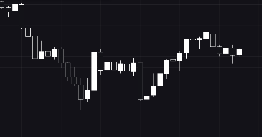
Candlestick charts have enjoyed continued use among traders because of the wide range of trading information they offer, along with a design that makes them easy to read and interpret.
This centuries-old charting style was developed in the rice markets of Japan. The style’s name refers to the way each time period is represented by a rectangle with lines coming out of the top and the bottom. This shape resembles a candlestick with a wick. The Japanese market watchers who used this style referred to the wick-like lines as “shadows.”
On the chart, each candlestick indicates the open, high, low, and close price for the time frame the trader has chosen.1 For example, if the trader set the time frame to five minutes, a new candlestick will be created every five minutes. For an intraday chart like this one, the open and close prices are those for the beginning and end of the five-minute period, not the trading session.
Candlesticks also show the current price as they’re forming, whether the price moved up or down over the time frame, and the price range the asset covered in that time.2
Open Price
The top or bottom of the candlestick body will indicate the open price, depending on whether the asset moves higher or lower during the five-minute period. If the price trends up, closing higher than it opened, the open is represented by the bottom of the body, and the close is represented by the top. If the price trends down, closing lower than it opened, the open is represented as the top of the candlestick (not including the wick) and the close is represented as the bottom. Candlesticks that close higher are often filled in as either a green or a white-colored candle. Candlesticks that close lower are often filled in as a black or red-colored candlestick.
High Price
The high price during the candlestick period is indicated by the top of the shadow or tail above the body. If the open or close was the highest price, then there will be no upper shadow.
Low Price
The low is indicated by the bottom of the shadow or tail below the body. If the open or close was the lowest price, then there will be no lower shadow.3
Close Price
The close is the last price traded during the candlestick, indicated by either the top (for a green or white candle) or bottom (for a red or black candledtick) of the body.4
As a candle forms, it constantly changes as the price moves. The open stays the same, but until the candle is completed, the high and low prices are changing. The color may also change as a candlestick forms. It may go from green to red, for example, if the current price was above the open price but then drops below it.
When the time period for the candle ends, the last price is the close price, the candle is completed, and a new candle begins forming.
Price Direction
You can see the direction the price moved during the time frame of the candlestick by the color and positioning of the candlestick. If the candlestick is green, the price closed above where it opened and this candle will be located above and to the right of the previous one, unless it’s shorter and of a different color than the previous candle. If the candlestick is red, the price closed below where it opened and this candle will be located below and to the right of the previous one, again unless it’s shorter and of a different color than the previous candle.4
Price Range
The distance between the top of the upper shadow and the bottom of the lower shadow is the range the price moved through during the time frame of the candlestick.4 The range is calculated by subtracting the low price from the high price.
Interpreting Patterns
You can practice reading candlestick charts by opening a demo trading account or playing around with candlesticks on free web-based charting platforms. Set the chart type to candlestick, and select a one-minute time frame so you’ll have lots of candlesticks to look at.
Once you understand what each candlestick is indicating, you can start looking for trading opportunities based on candlestick patterns, such as the three black crows and the abandoned baby.5
Frequently Asked Questions (FAQs)
What is the benefit of a candlestick chart?
Candlestick charts offer traders an easy way to track the price movement of a specific security during a specified period. Traders can see where the security was at the open and close, along with the high and low during the period, and make trading decisions accordingly.
How do you interpret a candlestick chart?
After you become familiar with what the basic components of the candlestick chart mean, you can begin to look for various patterns. Different shapes and lengths of candles signify different trends, and any trader should be familiar with how to read these patterns.


